Foundation Typography
Typography in Monster is meant to be readable, structural and reusable. This page explains how text styles behave in the system, not just how individual tags look in isolation.
For Developers
Prefer semantic HTML first. Use heading tags, lists, blockquotes, figures and code elements for structure, then rely on Monster styling to make them visually consistent.
The utility heading classes such as monster-h1 to monster-h6 exist for edge cases, but they should not replace proper document structure by default.
For Designers
The system favors stable reading rhythm over decorative variation. The important decisions are hierarchy, spacing, contrast and how text behaves inside complex UI such as forms, tabs, help messages and split layouts.
Use this page to validate that a type hierarchy still feels calm and legible when surrounded by real interface chrome.
The numbered blocks on this page are documentation guidance, not reusable surface cards. They intentionally stay flatter than application UI so hierarchy and reading rhythm remain the focus.
Basic Typography
All the typography of Monster uses rem for sizing. This means that accessibility is maintained for those who change their browser font size. The body element has a size of 1.15rem which makes all the standard font sizes slightly larger. This equates to 14pt for paragraph text, instead of the standard 12pt.
Accessibility baseline
rem-based sizing means browser zoom and user font-size preferences continue to work. That is a foundation rule, not an optional enhancement.
Reading before decoration
When in doubt, prefer calmer body text and stronger hierarchy instead of adding more visual styling. Typography should support comprehension first.
Headings
The heading elements also have an increased top margin to break blocks of text up better. Treat them as navigation landmarks for both people and assistive technologies.
Heading 1
Heading 2
Heading 3
Heading 4
Heading 5
Heading 6
<h1>Heading 1</h1>
<h2>Heading 2</h2>
<h3>Heading 3</h3>
<h4>Heading 4</h4>
<h5>Heading 5</h5>
<h6>Heading 6</h6>
<p class="monster-h1">Heading 1</p>
<p class="monster-h2">Heading 2</p>
<p class="monster-h3">Heading 3</p>
<p class="monster-h4">Heading 4</p>
<p class="monster-h5">Heading 5</p>
<p class="monster-h6">Heading 6</p>
In this example, you can see how the headings are used. Heading 1 is the largest and Heading 6 is the smallest.
You can achieve the size, color and spacing via the HTML tags h1-h6 or via the CSS classes monster-h1 to monster-h6 .
Nevertheless, the structured approach is generally preferable, as structure and appearance go together here. This can improve access to this page, especially for screen readers.
In the example above, we cheated a little and reduced the spacing so that the headings are easier to see together.
Typography elements
There are a number of other typography elements that you can use with Monster. These are the small content patterns that show up across documentation, forms, warnings, settings pages and live examples.
- All the standard stuff, like bold, italic and underlined text.
- Highlighting text
- Adding
inline codeusing thecodeelement. - Displaying keyboard commands like ALT+F4 using the
kbdelement.
Lists
Lists should stay simple and scannable. If a list item becomes a paragraph, it usually wants a subheading or a separate block instead.
- Item 1
- Item 2
- Item 3
- Do this thing
- Do that thing
- Do the other thing
Blockquotes
Sometimes you may want to quote someone else in your HTML. For this we use the blockquote element. Here’s what a quote looks like with Monster. The visual treatment should separate quoted voice from the surrounding prose without overwhelming the page.
Friends don’t spy; true friendship is about privacy, too.
– Stephen King
Code blocks
Code blocks are different from the inline code element. Use them for examples, configuration fragments and snippets that should be copied or scanned line by line.
                                    <div class="monster">

                                      <p>Hello, World!</p>

                                    </div>
HTML elements
Article
An article is a self-contained piece of content that could theoretically be distributed and reused independently of the rest of the page. This is a good way to structure your content for search engines and screen readers.
This is an article
Lorem ipsum dolor sit amet, consectetur adipiscing elit, sed do eiusmod tempor incididunt ut labore et dolore magna aliqua. Ut enim ad minim veniam, quis nostrud exercitation aliquip ex ea commodo consequat. Duis aute irure dolor in reprehenderit in voluptate dolore eu fugiat nulla pariatur. Excepteur sint occaecat cupidatat non proident, sunt in officia deserunt mollit anim id est laborum.
Section
Sections are good for splitting up a page into multiple thematic blocks. They become especially useful once a page grows large enough to need a table of contents.
This is a section
Lorem ipsum dolor sit amet, consectetur adipiscing elit, sed do eiusmod tempor incididunt ut labore et dolore magna aliqua. Ut enim ad minim veniam, quis nostrud exercitation ullamco laboris nisi ut aliquip ex ea commodo consequat. Duis aute irure dolor in reprehenderit in voluptate velit esse cillum dolore eu fugiat nulla pariatur. Excepteur sint occaecat cupidatat non proident, sunt in culpa qui officia deserunt mollit anim id est laborum.
Images
Images and figures should support the content around them. Always provide meaningful alt text, and use figure with figcaption when the image needs its own captioned context.
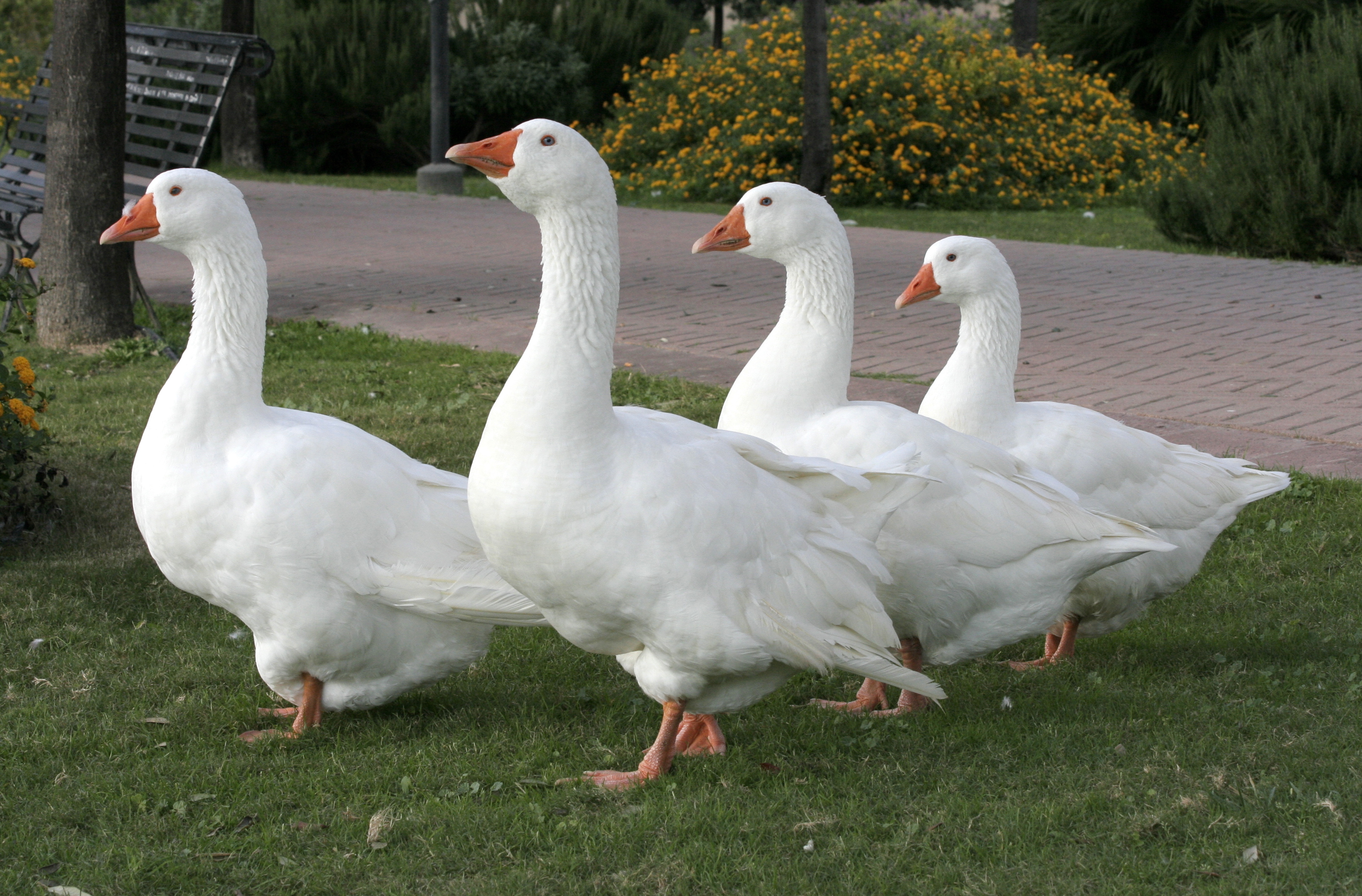 Ut enim ad minim veniam, quis nostrud exercitation ullamco laboris nisi ut aliquip ex ea commodo consequat. Duis aute irure dolor in reprehenderit in voluptate velit esse cillum dolore eu fugiat nulla pariatur.
 Details and Summary
This ist a simple example of the details and summary elements. Use them when progressive disclosure improves readability, not as a substitute for missing page structure.
Click to open
Yeah!🙂
Lorem ipsum dolor sit amet, consectetur adipiscing elit, sed do eiusmod tempor incididunt ut labore et dolore magna aliqua. Ut enim ad minim veniam, quis nostrud exercitation ullamco laboris nisi ut aliquip ex ea commodo consequat. Duis aute irure dolor in reprehenderit in voluptate velit esse cillum dolore eu fugiat nulla pariatur. Excepteur sint occaecat cupidatat non proident, sunt in culpa qui officia deserunt mollit anim id est laborum.