Select
Overview
The Select class in MonsterJS extends CustomControl, providing a rich, customizable select element.
It supports advanced features like filtering, multiple selection, lazy loading of options, and customizable
templates for displaying options and selections.
Key Features
- Rich Configuration: Supports a wide array of options for customization, including filtering, lazy loading, and multiple selection types.
- Dynamic Option Loading: Capable of fetching options from a remote source or populating them dynamically.
- Custom Templates: Allows defining custom templates for options and selections, enhancing the UI’s flexibility and interactivity.
- Form Association: Integrates seamlessly with forms, supporting both single and multiple selections.
- Accessibility: Adheres to accessibility standards, ensuring that the control is usable for all users.
Methods and Properties
Constructor
Initializes the select control with optional configurations, setting up internal structures and event handlers.
Instance Methods
click(): Toggles the visibility of the option list.focus(options): Sets focus on the select control, with optional parameters to control focus behavior.blur(): Removes focus from the select control.fetch(url): Fetches options from a specified URL or the configured URL.importOptions(data): Imports options from a given dataset, which can be an array, object, Map, or Set.
Attribute Observers
Overrides observedAttributes to monitor changes to relevant attributes for dynamic updates.
Form Association
value: Gets or sets the current selection(s), which can be a single value or an array of values for multiple selections.formAssociated: Indicates the control’s form-associated behavior.
Defaults
Provides default settings, including templates, labels, classes, option configurations, and more.
Static Methods
getTag(): Returns the tag name used for the select control (monster-select).getCSSStyleSheet(): Returns the CSS stylesheets associated with the select control.
Examples
The control can be created and used in various ways, including declarative HTML, JavaScript creation, and event handling.
This shows a basic example of creating a select control using HTML.
<monster-select></monster-select>
And this is an example of creating a select control using JavaScript.
const select = document.createElement('monster-select');
select.importOptions([{ label: 'Option 1', value: '1' }, { label: 'Option 2', value: '2' }]);
document.body.appendChild(select);
Event handling:
select.addEventListener('monster-selected', (e) => {
  console.log('Selection changed:', e.detail);
});
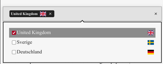
Select component allows user to pick any amount of option from the given data:
// create element
const select = document.createElement('monster-select');

// set multiselect
select.setOption('type', 'checkbox');

// set options
select.setOption('options', [
    {
        value: 'en', label: 'United Kingdom <img width=20
        src = "https://raw.githubusercontent.com/lipis/flag-icon-css/master/flags/4x3/gb.svg" > '},
    {
        value: 'se', label: 'Sverige <img width=20
        src = "https://raw.githubusercontent.com/lipis/flag-icon-css/master/flags/4x3/se.svg" > '},
    {
        value: 'de', label: 'Deutschland <img width=20
        src = "https://raw.githubusercontent.com/lipis/flag-icon-css/master/flags/4x3/de.svg" > '}
]);

// insert element into the DOM
document.getElementById('body').appendChild(select);
Single select
Radios are used for the single selection.
select.setOption('type', 'radio');
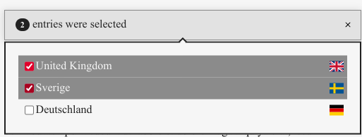
Multiselect
Checkboxes are used for multiple selection.
select.setOption('type', 'checkbox');
Import data
The options can be imported from an object. The object can be read in either directly via
Select.importOptions() or indirectly via a URL. In the example, a json file is
imported via https://monsterjs.org/assets/world.json`.
select.setOption('url', 'https://monsterjs.org/assets/world.json')
Alternatively, the data can also be imported from an object.
select.importOptions([
    {
        "name": "United Kingdom",
        "alpha-2": "GB",
        "country-code": "826",
    },
    {
        "name": "Sweden",
        "alpha-2": "SE",
        "country-code": "752",

    },
    {
        "name": "Germany",
        "alpha-2": "DE",
        "country-code": "276",
    }
]);
The mapping of the data to the options is done using the values defined in the mappings key.
select.setOption('mapping.labelTemplate', '${name} (${alpha-2})')
select.setOption('mapping.valueTemplate', '${country-code}')
If you want to specify a deeper structure, you can do so via selector`.
{
    a: {
        b: {
            c: [
                ....
        ]
        }
    }
}

select.setOption('mapping.selector', 'a.b.c')
It is also possible to filter values. This is done via the filter parameter. Further details on the structure of the map can be found in the Monster documentation.
There is also an example.
select.setOption('mapping.filter', function (value, key) {
    return (value['id'] >= 20) ? true : false
})
Options via DIV elements
The options can also be defined via HTML. The following example shows how to define the options.
Important is the monster-value attribute. This is used to define the value of the option.
The label is defined by the content of the div.
<monster-select>
    <div data-monster-value="value1">label-1</div>
    <div data-monster-value="value2">label-2</div>
    <div data-monster-value="value3">label-3</div>
</monster-select>
Display selected options
There are two predefined templates for displaying the selected options. The first is the default template.
import {getSelectionTemplate}
    from '@schukai/monster/source/dom/select.mjs';

select.setOption('templateMapping.selected',
    getSelectionTemplate())
The second is the summary template. This template is used to display the selected options in a summary.
To configure the summary, the templateMapping.summary option can be used.
The template can be changed via the templateMapping.selected option should be filled with the template.
import {getSummaryTemplate} from '@schukai/monster/source/dom/select.mjs';

select.setOption('templateMapping.selected',
    getSummaryTemplate())
You can also define your own template.
select.setOption('templateMapping.selected',
    "<div>Selected: ...</div>")
With the attribute data-monster-selected-template you can also define the template directly in the HTML.
Available templates are summary and selected.
<monster-select data-monster-selected-template="summary">

</monster-select>
Features
With the features option, the behavior of the component can be changed. The following features are available.
closeOnSelect
The closeOnSelect feature closes the select control after an option has been selected.
select.setOption('features.closeOnSelect', true)
clearAll
The clearAll feature shows a button to clear all selected options.
select.setOption('features.clearAll', true)
clear
The clear feature shows a button to clear
select.setOption('features.clear', true)
lazyLoad
The lazyLoad feature loads the data when the select control is opened.
select.setOption('features.lazyLoad', true)
emptyValueIfNoOptions
This can be used to control whether values that are not in the options are deleted. The default behavior is now that undefined values are also displayed.
select.setOption('features.emptyValueIfNoOptions', true)
Events
The following events are fired by the component.
I18n
The component can be translated into different languages. For this you simply have to translate
the corresponding labels. This can be done using the Select.setOption() method.
select.setOption('labels', {
    'cannot-be-loaded': 'The data cannot be loaded',
    'no-options-available': 'No options available'
});
You can also use the translation function. Therefore, the component can be translated via the Select.updateI18n() methods.
const selects = document.querySelector('monster-select')
select.updateI18n();
To see the keys of the translations, you can look at the default values under the labels key.
selects.getOption('labels')
// ↦ { .... }
Plural rules are available for the selection text. These can be set via the labels.summary-text option.
In the following example, the locales are set via an embed provider. First the keys are defined:
<script type="application/json" data-monster-role="translations">
    {
        "summary-text": {
            "zero": "Non sono state selezionate voci",
            "one": ",<span class='monster-badge-primary-pill'>1</span> voce è stata selezionata",
            "other": "Sono state selezionate <span class='monster-badge-primary-pill'>${count}</span> voci"
        }
    }
</script>
The translations are then assigned to the component.
Embed.assignTranslationsToElement().then(() => {
  select.updateI18n();
});
Layout
The select control can be customized to your own needs. For this purpose, the control can be designed via CSS.
The different parts of the control can be designed using CSS. Since the internals of the component are in a shadow tree, access is via css pseudo-element parts.
monster-select::part(popper) {
    background-color: white;
}
The individual parts are shown in the following picture.

This documentation outlines the Select class’s capabilities and configuration options,
enabling developers to incorporate sophisticated select controls into their web applications.