Overlay
The overlay component is used to display a modal dialog. It is used by the host component to display the login dialog. Im Standard wird oben links, absolute positioniert, ein Button angezeigt, der das Overlay öffnet. Das Overlay kann auch über den Aufruf der Methode open() geöffnet werden.
Usage
Overlay component allows user to display a modal dialog:
// create element
const select = document.createElement('monster-overlay');

// insert element into the DOM
document.getElementById('body').appendChild(select);
Overlay-Content
The content of the overlay can be set via slotted content. The content is displayed in the body of the overlay. In this example, the content is a simple text.
<monster-overlay>
    <p>I am the content of the overlay.</p>
</monster-overlay>
It is also possible to load the content from an external file. For this purpose, the reload component is used.
<monster-overlay>
    <monster-reload data-monster-url="./nav.html"></monster-reload>
</monster-overlay>
Multiple Overlay-Content
It is also possible to embed multiple overlays. The buttons are positioned absolute, therefore the containing div must be positioned relative.
<div style="position:relative">
    <monster-overlay>
        <monster-reload data-monster-url="./nav.html"></monster-reload>
    </monster-overlay>
</div>

<div style="position:relative">
    <monster-overlay>
        <p>I am the content of the overlay.</p>
    </monster-overlay>
</div>
Events
The following events are fired by the component.
- monster-overlay-before-open
- monster-overlay-open
- monster-overlay-before-close
- monster-overlay-closed
Layout
The select control can be customized to your own needs. For this purpose, the control can be designed via CSS.
The different parts of the control can be designed using CSS. Since the internals of the component are in a shadow tree, access is via css pseudo-element parts.
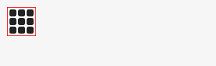
To change the color of the open button, the following CSS can be used.
monster-overlay::part(open) {
    border: 1px solid red;
}
The result is shown in the following picture.
The individual parts are shown in the following picture.
