Imagine you’re in the middle of a coding quest, navigating through a labyrinth of
JavaScript and CSS. Just when the complexity seems to be a never-ending loop,
along comes Monster, your new coding ally, ready to streamline your frontend adventure.
Monster isn’t just another JavaScript library. It’s the sidekick you didn’t know you
needed, ready to enhance your frontend endeavors. It’s designed to blend seamlessly
into your project, empowering you without overshadowing your existing setup.
Embark on a journey with Monster, and there’s no turning back to the mundane.
In the ‘Getting Started’ section, we’ll unveil how to welcome Monster into your
project, transforming your frontend development journey.
Monster is not just free; it’s liberating. It’s customizable to its core,
adaptable to any project you’re working on, be it an e-commerce platform
or a personal portfolio.
Monster’s true beauty lies in its adaptability. It stands strong on
its own with no dependencies but also collaborates smoothly with
other libraries and frameworks, such as jQuery and Bootstrap.
Monster comes with a set of core design goals that it pledges to uphold:
Reusability: Craft web components once and reuse them across your application, minimizing code duplication and boosting maintainability.
Modularity: Assemble complex UIs from smaller, modular components, enhancing the development process.
Interoperability: Built on web standards, Monster ensures compatibility across different technologies and frameworks, facilitating integration into existing projects.
Performance: Monster is lightweight yet powerful, designed for swift rendering and updates, enhancing your application’s performance.
Adaptability: With widespread adoption and standards compliance, you’ll find a robust support community and ample resources for guidance.
Flexibility: Free from framework constraints, Monster allows you to choose the best tools for your project needs.
With MonsterJS and its web components, you’re set to elevate the scalability,
maintainability, and performance of your web applications.
Ready to revolutionize your frontend development experience with Monster?
Stay tuned and embark on this transformative coding journey!
Embarking on your Monster journey requires a basic understanding of HTML, CSS, and JavaScript. If you’re new to frontend development,
consider having a beginner’s guide handy as you explore Monster.
For additional support, join the conversation on Stack Overflow
by tagging your queries with “javascript” and “monster”. Alternatively, engage with our community
right here in this ChatGPT Monster Chat for tailored assistance.
Launch this file in your browser to see Monster’s ‘Version’ class in action, displaying a version number on your page.
Well done! You’ve just harnessed a slice of Monster’s capabilities. Each Monster component operates
independently, allowing you to cherry-pick the features you need. Or, you can embrace Monster in its
entirety for a comprehensive toolkit.
Monster is accessible through CDNs like jsDelivr and Skypack or can be integrated via NPM or git
repositories, offering versatility without dependencies, making it compatible with frameworks like
Bootstrap or jQuery.
The CSS Style guide for Monster is a set of guidelines and best practices for writing and organizing CSS code.
It is designed to help developers maintain a consistent and organized codebase, making it easier to read,
understand, and modify. The style guide covers a wide range of topics, including naming conventions,
code organization, and performance optimization. Following the guidelines in this style guide will
help ensure that your CSS code is clean, maintainable, and efficient.
The following example shows how to include the stylesheets independently of the rest of the document.
<!-- here we define the desired content -->
<template id="contenttemplate">
    <p>this is an example</p>
</template>

<script type="module">

    // here we import the stylesheets
    import {NormalizeStyleSheet} from
                '@schukai/monster@latest/source/components/stylesheet/normalize.mjs';
    import {PropertyStyleSheet} from
                '@schukai/monster@latest/source/components/stylesheet/property.mjs';
    import {ColorStyleSheet} from
                '@schukai/monster@latest/source/components/stylesheet/color.mjs';
    import {ThemeStyleSheet} from
                '@schukai/monster@latest/source/components/stylesheet/theme.mjs';

    // we create a node
    const node = document.createElement('div');

    // we attach the shadow root to the node
    const shadow = node.attachShadow({ mode: 'open' });

    // we clone the template and attach it to the shadow root
    const template = document.getElementById('contenttemplate');
    shadow.appendChild(template.content.cloneNode(true));

    // we attach the stylesheets to the shadow root
    shadow.adoptedStyleSheets = [
        NormalizeStyleSheet,
        PropertyStyleSheet,
        ColorStyleSheet,
        ThemeStyleSheet
    ];

    // we attach the node to the body
    document.body.appendChild(node);

</script>
This page is a demonstration of the elements that can be formatted
using Monster. It is not intended to be a comprehensive guide to
typography, but rather a reference of the styles that are available.
Basic Typography
All the typography of Monster uses
rem for sizing. This means that accessibility is
maintained for those who change their browser font size. The body element
has a size of 1.15rem which makes all the standard
font sizes slightly larger. This equates to 18.4px for
paragraph text, instead of the standard 16px.
The heading elements also have an increased top margin in order to break blocks of text up better.
Heading 1
Heading 2
Heading 3
Heading 4
Heading 5
Heading 6
Links & Buttons
Lorem ipsum dolor sit amet, consectetur adipiscing elit, sed do eiusmod tempor incididunt ut labore et dolore
magna aliqua. Ut enim ad minim veniam, quis nostrud exercitation ullamco laboris nisi ut aliquip ex ea commodo
consequat. Duis aute irure dolor in reprehenderit in voluptate velit esse cillum dolore eu fugiat nulla
pariatur. Excepteur sint occaecat cupidatat non proident, sunt in culpa qui officia deserunt mollit anim id est
laborum.
There are a number of other typography elements that you can use with Monster. Some of the common ones
are:
All the standard stuff, like bold, italic and underlined text.
Highlighting text.
Adding inline code using the code element.
Displaying keyboard commands like ALT+F4 using the kbd element.
Lists
We all love a perfect list?
Item 1
Item 2
Item 3
Do this thing
Do that thing
Do the other thing
Blockquotes
Sometimes you may want to quote someone else in your HTML. For this we use the blockquote element. Here’s what a quote looks like with
Monster:
Friends don’t spy; true friendship is about privacy, too.
– Stephen King
Code blocks
Code blocks are different from the inline code element.
Code blocks are used when you want to display a block of code, like this:
Other HTML elements
Article
This is an article
Lorem ipsum dolor sit amet, consectetur adipiscing elit, sed do eiusmod tempor incididunt ut labore et dolore
magna aliqua. Ut enim ad minim veniam, quis nostrud exercitation ullamco laboris nisi ut aliquip ex ea
commodo consequat. Duis aute irure dolor in reprehenderit in voluptate velit esse cillum dolore eu fugiat
nulla pariatur. Excepteur sint occaecat cupidatat non proident, sunt in culpa qui officia deserunt mollit
anim id est laborum.
Section
Sections are good for splitting up a page into multiple…sections.
This is a section
Lorem ipsum dolor sit amet, consectetur adipiscing elit, sed do eiusmod tempor incididunt ut labore et dolore
magna aliqua. Ut enim ad minim veniam, quis nostrud exercitation ullamco laboris nisi ut aliquip ex ea
commodo consequat. Duis aute irure dolor in reprehenderit in voluptate velit esse cillum dolore eu fugiat
nulla pariatur. Excepteur sint occaecat cupidatat non proident, sunt in culpa qui officia deserunt mollit
anim id est laborum.
Images
Lorem ipsum dolor sit amet, consectetur adipiscing elit, sed do eiusmod tempor incididunt ut labore et dolore
magna aliqua.
Ut enim ad minim veniam, quis nostrud exercitation ullamco laboris nisi ut aliquip ex ea commodo
consequat. Duis aute irure dolor in reprehenderit in voluptate velit esse cillum dolore eu fugiat nulla
pariatur.
This is a black swan
Accordions
Lorem ipsum dolor sit amet, consectetur adipiscing elit, sed do eiusmod tempor incididunt ut labore et dolore
magna aliqua. Ut enim ad minim veniam, quis nostrud exercitation ullamco laboris nisi ut aliquip ex ea commodo
consequat.
Click to open
Yeah!🙂
Lorem ipsum dolor sit amet, consectetur adipiscing elit, sed do eiusmod tempor incididunt ut labore et dolore
magna aliqua. Ut enim ad minim veniam, quis nostrud exercitation ullamco laboris nisi ut aliquip ex ea commodo
consequat. Duis aute irure dolor in reprehenderit in voluptate velit esse cillum dolore eu fugiat nulla
pariatur. Excepteur sint occaecat cupidatat non proident, sunt in culpa qui officia deserunt mollit anim id est
laborum.
The z-index property specifies the stack order of an element. An element with greater stack order is always in front
of an element with a lower stack order.
Media queries are used to apply different styles to a document depending on the size of the screen.
Media queries are defined in the @media rule. The @media rule is used inside a style sheet to apply
different styles for different media types/devices.
More information about media queries can be found
on MDN.
In Monster we use the following media queries:
Class
From
To
viewport0
0
480px
viewport-4
0
480px
viewport-7
0
768px
viewport-9
0
992px
viewport-12
0
1200px
viewport4
480px
∞
viewport7
768px
∞
viewport9
992px
∞
viewport12
1200px
∞
viewport4-7
480px
768px
viewport7-9
768px
992px
viewport9-12
992px
1200px
In the following graphic you can see the different media queries and the corresponding mixins.
Skeleton is a CSS class that provides a loading animation for elements. It can be used to indicate that an element
is loading or that the user has to wait for the content to be loaded. The monster-skeleton-col-xxx classes define
the look of the skeleton. The xx defines the width of the skeleton in percent. monster-skeleton-col-100 is the
widest skeleton and monster-skeleton-col-10 is the narrowest skeleton.
The monster-skeleton-animated class defines the animation.
The spinner is a CSS class that provides a loading animation. So that the spinner can be used
in different situations, it is possible to set the size and the theme and the spinner is not
a component.
Color is part of the visual language of a design system. It is used to communicate meaning, organize elements,
and create visual interest in designs. Color is also used to create contrast between elements, so that users
can easily scan and interact with content.
The theme colors are listed below. The values must be prefixed with
monster-theme-. The colors contain a definition for the background and the text.
The color scheme is optimized for display in light and dark mode.
The border colors are listed below. The values must be prefixed with monster-.
The colors contain a definition for the border including the border width and the border style.
A card is a flexible and extensible content container.
<div class="cards">
    <div class="card">
        <img src="./bg.jpg" alt="">
        <p>Lorem ipsum dolor sit amet, consetetur sadipscing elitr, sed diam nonumy eirmod tempor invidunt ut
            labore et dolore magna aliquyam erat, sed diam voluptua.</p>
        <button>button</button>
    </div>
    <div class="card">
        <p>Lorem ipsum dolor sit amet, consetetur sadipscing elitr, sed diam nonumy eirmod tempor invidunt ut
            labore et dolore magna aliquyam erat, sed diam voluptua.</p>
        <button>button</button>
    </div>
    <div class="card">
        <button>button</button>
        <img src="./bg.jpg" alt="">
        <p>Lorem ipsum dolor sit amet, consetetur sadipscing elitr, sed diam nonumy eirmod tempor invidunt ut
            labore et dolore magna aliquyam erat, sed diam voluptua.</p>
        <button>button</button>
    </div>
    <div class="card">
        <h1>Lorem ipsum </h1>
        <button>button</button>
        <p>Lorem ipsum dolor sit amet, consetetur sadipscing elitr, sed diam nonumy eirmod tempor invidunt ut
            labore et dolore magna aliquyam erat, sed diam voluptua.</p>
        <button>button</button>
    </div>
</div>
Badges are used to highlight an item’s status for quick recognition.
They can be used to indicate the status of an item or to draw attention
to an item.
The Document Object Model (DOM) is a programming interface for HTML and XML documents.
It represents the structure of a document as a tree-like structure, where each node in the
tree represents an element, attribute, or text content in the document.
JavaScript provides a set of functions and classes for working with the DOM, including methods
for creating, modifying, and querying elements, as well as handling events.
JavaScript’s DOM functions and classes can be divided into several categories:
Document: this includes the Document object, which represents the entire HTML or XML document and provides methods for manipulating the structure and content of the document.
Element: This includes classes such as HTMLElement, which represent an HTML element and provide methods for manipulating the attributes, content, and style of the element.
Event: This includes classes such as Event and EventTarget, which provide methods for processing and responding to events such as clicks, mouse movements, and keystrokes.
Node: This includes classes such as Node, which represent a node in the DOM tree and provide methods for processing the node’s parent and child nodes.
Selector: These include functions such as document.getElementById(), document.querySelector(), and document.querySelectorAll(), which are used to select elements from the DOM by their ID, class, or tag name.
By using these functions and classes, developers can create dynamic and interactive web pages
and develop a variety of web applications.
In this section, we will delve deeper into the functions and classes provided by Monster and provide
examples of their usage for manipulating the DOM and handling events.
A new updater is created in this case via the following call.
const updater = new Updater(document.getElementById('form1'));
With the method Updater.getSubject() you can get the structure of the updater. If you want to use an already defined structure, you can pass it to the updater as a second parameter.
let subject =  updater.getSubject();
console.log(subject);
Now we want a click on the checkbox to be mapped in the data structure.
To do this we need to extend the html with the data-monster-bind attribute.
The values or states of controls are mapped to the data structure via this binding.
In this case the status of the checkbox is mapped to the key state. If the checkbox is selected the field state contains the value on , otherwise state is undefined.
If you want to use another value instead of on, you can set the attribute value.
Welcome to the Monster Templating Guide, where we explore the dynamic and intuitive DOM-based templating system designed
to enhance your HTML with powerful, data-driven components. Monster leverages modern web technologies to offer a
seamless integration between your data and the document object model (DOM), enabling real-time updates and manipulations
with minimal code.
You can integrate Monster’s data-binding attributes directly into your HTML or dynamically via JavaScript. Here’s how
you can dynamically insert an HTML element with Monster’s data-binding attribute:
To replace the content of an HTML element, use the data-monster-replace attribute. This attribute accepts a path to
your data or static values, optionally applying transformations:
Add or modify HTML attributes through the data-monster-attributes attribute, specifying the attribute name followed by
a pipe (|) and the desired operations:
<div data-monster-attributes="id static:myid, class static:myclass">hello</div>
Let’s incorporate the missing details on data binding and add a comprehensive table to summarize the attribute types and
their functionalities, enhancing the documentation’s completeness and usability.
The data-monster-bind attribute allows for two-way data binding between HTML input elements and the JavaScript data
model. This powerful feature ensures that changes in the input field automatically update the data model and vice versa,
keeping your UI and data model in sync.
To complete the documentation, let’s include the detailed explanation of data types supported by
the data-monster-bind-type attribute. This addition ensures a thorough understanding of how to accurately bind various
data types from your model to your UI elements.
When binding data to input elements using data-monster-bind, it’s crucial to specify the type of data being bound.
This ensures that the data is correctly interpreted and manipulated within your application.
The data-monster-bind-type
attribute supports several data types, each with specific behavior and formatting requirements.
The CustomElement class in MonsterJS is a foundational class for creating new HTML elements using the Web
Components Custom Elements API. It enables developers to define new HTML tags with custom behavior and
appearance, encapsulating functionality in a reusable component.
Easy Element Creation: Create instances of custom elements using document.createElement() or by including the tag directly in HTML.
Lifecycle Callbacks: Utilize standard custom element lifecycle callbacks like connectedCallback, disconnectedCallback, etc., to manage the element’s lifecycle effectively.
Attribute Observers: Monitor changes to attributes and react accordingly using the attributeChangedCallback method.
Shadow DOM Support: Encapsulate your element’s styles and markup using the shadow DOM, with support for open and closed shadow modes.
Styling Integration: Integrate CSS styling directly into your custom elements, ensuring encapsulation and avoiding style leakage.
Event Handling: Define and handle custom events, making your element interactive and responsive to user actions.
Extensibility: Extend from HTMLElement to create complex controls with rich functionality.
Declarative Configuration: Configure elements declaratively using HTML attributes or programmatically via JavaScript.
The constructor initializes the element, setting up options and the shadow root if necessary.
It is not intended to be called directly but is triggered when an instance of the element is created.
To integrate custom functions with Element Updaters, a control must
implement the [updaterPipeCallbacksSymbol] method. This method should return an object
containing key-value pairs, where the key is a unique name for the callback, and the
value is the function itself.
In this template snippet, the data-monster-replace attribute is used to dynamically update the
content of the <div>. The call:my-callback-doing part specifies that the my-callback-doing
function should be applied to the value obtained from path:options | index:label.
The CustomControl class in MonsterJS extends the CustomElement class, offering additional
capabilities specific to form-associated custom elements. It leverages the ElementInternals
API to integrate custom elements into HTML forms, enabling them to participate in form submission,
validation, and other form-related behaviors.
class MyCustomControl extends CustomControl {
    static getTag() {
        return 'my-custom-control';
    }

    get value() {
        // Custom logic to retrieve the control's value
    }

    set value(value) {
        // Custom logic to set the control's value
    }
}

registerCustomElement(MyCustomControl);
The CustomControl class empowers developers to create complex, form-associated custom elements,
enhancing the capabilities of web forms with custom logic and behaviors.
FocusManager is a class within MonsterJS designed to manage and manipulate focus within a document.
It provides methods to store, restore, and shift focus among elements, facilitating enhanced keyboard
navigation and focus management in web applications.
Focus Storage: Allows storing the current focus state and retrieving it later, which is particularly useful for modal interactions or complex UI transitions.
Focus Navigation: Enables moving focus to the next or previous focusable element within a context, supporting accessible keyboard navigation.
Focus Control: Offers methods to programmatically focus or query focusable elements, enhancing dynamic interaction and responsiveness in user interfaces.
const focusManager = new FocusManager();

// Store the current focus before opening a modal
focusManager.storeFocus();

// ... open modal and interact with it ...

// Restore focus after closing the modal
focusManager.restoreFocus();
Navigating focus programmatically:
// Focus the next focusable element in the document
focusManager.focusNext();

// Focus the previous input element
focusManager.focusPrev('input');
The FocusManager class is a powerful tool for developers to enhance accessibility and user
experience by providing robust focus management capabilities in web applications.
Web components are a set of technologies that allow developers to create custom, reusable elements for use in Web pages
and Web applications.
in Web pages and Web applications. These elements, called custom elements, can be created using JavaScript,
HTML, and CSS, and are fully functional and can be used just like any other standard HTML element.
Web components are a key aspect of web development because they allow developers to create reusable, modular code that
can be easily shared and integrated.
code that can be easily shared and integrated with other projects. In addition, because Web Components
are part of the Web platform and not tied to a specific framework or library, they are highly portable
and can be used in a variety of environments. Overall, Web Components provide a powerful and flexible way to
way to build Web applications and create custom, reusable elements for Web pages.
First, we create a class derived from CustomControl. The parent class CustomControl already implements some functions that will make life in the following
easier.
class Button extends CustomControl {
}
The next step determines which tag the control should get in the HTML.
To be able to configure the control later, we have to create the possibility,
to be able to create options. We can use the structures of the class
CustomControl and only need to create a separate property default.
class Button extends CustomControl {

    // ..... other implementations

    get defaults() {
        return Object.assign({}, super.defaults, {})
    }

}
The templates of the control are also defined via this structure. In this way one can
the control with a standard and give the user of the control the possibility to adapt the templates.
Customize the templates.
So, now let’s get to work on the appearance of the control and create a template for it.
We want the button to use a simple HTML5 button.
<button>Hello!</button>
The main template of the button is maintained via the templates.main option.
So, we have to insert the HTML into the default structure introduced above. We can
specify the HTML directly here.
If we now insert the HTML tag <monster-button></monster-button> into an HTML file
we get so far so unspectacular a button.
Now comes the magic. In the DOM there are two important methods that are called when a control is included and removed.
When a control is removed.
If a control is hooked into the DOM, the method connectedCallback is called.
When a control is removed from the DOM, on the other hand, the method
disconnectedCallback is called
We implement both methods in our new class.
class Button extends CustomControl {

    // ..... other implementations

    connectedCallback() {
        super.connectedCallback();
    }

    disconnectedCallback() {
        super.disconnectedCallback();
    }
}
Within these two methods, we can now initialize structures or add and remove event handlers.
Adding and removing event handlers.
The CustomControl has two other important methods that can be overridden to initialize, they
can be overridden to initialize the control. These two methods
have no direct method name, but are hidden behind a symbol key.
symbol key.
import {
    assembleMethodSymbol,
    initMethodSymbol,
} from "@schukai/monster/dist/modules/dom/customelement.js";

class Button extends CustomControl {

    // ..... other implementations

    [initMethodSymbol]() {
        super[initMethodSymbol]();
    }

    [assembleMethodSymbol]() {
        super[assembleMethodSymbol]();
    }
}
The method initMethodSymbol is called directly from the constructor and is used for one-time initialization of internal structures.
internal structures.
The method assembleMethodSymbol is called the first time the control is included in the
DOM. If the control is removed and re-included, the assembleMethodSymbol method is called.
assembleMethodSymbol` is not called again.
Many of the components of the Monster Control can be configured.
Components are created either by a tag in the HTML code or by the document.createElement method.
Mittels JavaScript können die Monster Controls über die Methode setOption konfiguriert werden.
Dazu muss der Name der Option und der Wert übergeben werden.
monster.setOption('optionName', 'optionValue');
A list of available options can be found in the respective documentation of the component or can be read out using the default property.
const control = document.createElement('monster-control');
console.log(control.default);
There are three ways to configure a Monster Control via HTML.
Almost every option can also be set via an attribute. The name of the attribute begins with
data-monster-option- and ends with the name of the option. The value of the attribute is the value of the option.
The name of the option is converted to a property path. It replaces the dashes with dots to form the property path.
For example, the attribute ‘data-monster-option-url’ maps to the ‘url’ property in the options object.
With the mapping parameter, the attribute value can be mapped to a different value.
For example, the attribute ‘data-monster-option-foo’ maps to the ‘bar’ property in the options object.
The mapping object would look like this:
{
'foo': (value) => value + 'bar'
// the value of the attribute 'data-monster-option-foo' is appended with 'bar'
// and assigned to the 'bar' property in the options object.
// e.g. <div data-monster-option-foo="foo"></div>
'bar.baz': (value) => value + 'bar'
// the value of the attribute 'data-monster-option-bar-baz' is appended with 'bar'
// and assigned to the 'bar.baz' property in the options object.
// e.g. <div data-monster-option-bar-baz="foo"></div>
}
Here is an example of how to configure a Monster Control via attributes.
The dataset component needs a datasource to get the data that should be displayed in the table. The datasource can be
configured via the data-monster-datasource-selector attribute. The value of the attribute is a selector that
points to the datasource component.
The datatable component is a component that allows you to display data in a table. The datatable is build with the css
grid system and is therefore very flexible.
data-monster-mode="fixed": Specifies that the column cannot be removed or hidden.
data-monster-attributes="href path:this-is-a-row-id.oid | tostring | prefix:#": Adds an href attribute to the element with the value from this-is-a-row-id.oid. The value is passed through the pipe | to tostring and converted to a string. Then, the prefix # is added.
data-monster-replace: Replaces the child nodes of an element with the value from the specified path.
data-monster-sortable="number": Indicates that the column is sortable by the number property. You can add asc or desc as a second parameter. This allows you to preset a specific sort order.
data-monster-head="Number": Sets the header for the column to the specified name (e.g., “Number”).
This example creates a footer with a button group containing three buttons labeled
“Aktion 1”, “Aktion 2”, and “Aktion 3”. Customize the footer content as needed for your specific use case.
This example adds a pagination control that uses a datasource selector with the ID data1.
Customize the datasource selector and other attributes as needed for your specific use case.
To add a filter button and a filter area to the Monster-Datatable, insert a monster-datatable-filter-button
element within the div element with the slot="bar" attribute:
This filter button opens a section that contains a filter when clicked. Define the filter area using a
monster-collapse element with the appropriate ID and a data-monster-role=“filter-collapse” attribute:
This example creates a filter area with an input field for filtering by “OID”. Customize the filter area and other
attributes as needed for your specific use case.
The datatable component needs a datasource to get the data that should be displayed in the table. The datasource can be
configured via the data-monster-datasource-selector attribute. The value of the attribute is a css selector that
points to the datasource component.
The columns of the datatable are defined via a template element. The template element must have the id attribute
with the value row.
Every column is defined via a div element. The div element can configure the following attributes:
The headlines of the table are defined via the data-monster-head attribute. The value of the attribute is a json
<div data-monster-head="ID"></div>
The columns of the data table can be localized. For this purpose, the prefix i18n: must be specified in the title
attributes data-monster-head.
<div data-monster-head="i18n:myKey"></div>
The alignment of the column is defined via the data-monster-align attribute. The value of the attribute is a css.
<div data-monster-align="center"></div>
When a column is sortable, the data-monster-sortable attribute must be set. The value of the attribute is the name of
the column in the datasource.
<div data-monster-sortable="id"></div>
The mode of the datatable can be set via the data-monster-mode attribute. The value of the attribute is a string that
can be fixed, visible or hidden. The default value is visible.
<div data-monster-mode="fixed"></div>
Fixed means that the column is always visible. Visible means that the column is visible as long as nothing else has been
configured. Hidden means that the column is hidden as long as nothing else has been configured.
The visibility of the columns can be specified when defining the table. The user can show and hide all non-fixed
columns.
The settings can be stored in the client if a monster-host component is available on the page.
The data is stored in the indexedDB. Additionally, the datatable needs an ID. This is set via the attribute ‘id’.
The select control can be customized to your own needs. For this purpose, the control can be designed via
css.
The different parts of the control can be designed using CSS. Since the internals of the component are
in a shadow tree, access
is via css pseudo-element parts.
The <monster-datatable-filter> HTML control is used to define filters for a data table.
Within the control, you can create one or more labels, each representing a filter.
These labels must be placed inside the control and can include any HTML controls.
Here is an example of a <monster-datatable-filter> control:
This defines a filter that can be used to filter data by OID. The filter is hidden by default,
but can be selected from the dropdown menu in the data table. The following image shows the filter.
The data-monster-label attribute is used to specify the name of the filter as it will appear in the dropdown
menu where users can select filters. In the example above, the data-monster-label attribute is set to “OID”.
The data-monster-template attribute is used to define how the key and input value are combined to create a
query part. For example, using data-monster-template="oid=${value}" and entering the value 1425 would result in
the query oid=1425.
In the example provided, the data-monster-template attribute is set to "${value | call:range:oid}",
which calculates a range. If a user enters “1425-1430”, the resulting query would be oid>=1425 AND oid<=1430.
This expression takes the input range and converts it into a query that includes both the lower and upper
bounds of the range.
The style="display:none" attribute is used to hide the filter initially. This ensures that the filter is not
visible until the user selects it from the dropdown menu.
To position the filter within the filter area of the data table, you can include the slot="filter"
attribute. This attribute ensures that the filter is displayed in the correct location within the data table.
The select control can be customized to your own needs. For this purpose, the control can be designed via
css.
The different parts of the control can be designed using CSS. Since the internals of the component are
in a shadow tree, access
is via css pseudo-element parts.
The <monster-datatable-status> HTML control is used to display the status of a datasource.
The status can display the loading state and the error state. The loading state is displayed
when the datasource is request data. The error state is displayed when the datasource has an error.
The <monster-datatable-status> HTML control is used to display the status of a datasource.
It should be placed inside the <monster-datatable> HTML control.
The data-monster-option-datasource-selector attribute is used to set the datasource.
The value of the attribute is a CSS selector. The selector must point to a Monster
Datasource HTML control.
The error status can be translated into different languages. Therefore, the monster-datatable-status' component component implements the i18n transformer. For example, if you have the following status: Failed to fetch`, which is
usually thrown by the in the datasource, you can add a translation by adding the following code to your HTML file.
<script type="application/json" data-monster-role="translations">
{
  "Failed to fetch": "This is an error message"
}
</script>
The pagination component needs a datasource to get the data that should be used to calculate the pagination. The datasource can be
configured via the data-monster-datasource-selector attribute. The value of the attribute is a selector that
points to the datasource component.
The embedded dataset pagination component is a component that can be used to paginate the data that is displayed in a datatable
component. It is derived from the pagination component and can be used in the same way. The only difference is that it has
an embedded style.
The pagination component needs a datasource to get the data that should be used to calculate the pagination. The datasource can be
configured via the data-monster-datasource-selector attribute. The value of the attribute is a selector that
points to the datasource component.
After the datasource is configured, the datatable can be configured.
The reference to the datasource is made via the data-monster-datasource-selector attribute.
The headlines of the table are defined via the data-monster-head attribute.
If no value is defined, the number of the column is used as the headline.
The grid template width is defined via the data-monster-grid-template attribute.
The default value is 1fr.
With the data-monster-align attribute, the alignment of the content can be defined.
Values are start, center and end. Additionally, the alignment should be defined in the CSS class for the column.
And now the datatable is ready to use. The pagination can be used to load more data.
The reference to the datasource is made via the data-monster-datasource-selector attribute.
The SplitScreen html tag can be used to create a split screen with two panels. In the example below, the split screen
is
divided vertically with a 70% dimension for the start panel.
The split screen control can be customized to your own needs. For this purpose, the control can be designed via
css.
The different parts of the control can be designed using CSS. Since the internals of the component are
in a shadow tree, access
is via css pseudo-element parts.
The Tabs component allows the user to switch between multiple contents based on a navigation bar.
The text for the buttons is formed from the content of the divs. No tab is active.
To use an explicit text for the button, you can use the data-monster-button-label attribute.
If you also want to specify an icon, the attribute data-monster-button-icon` is available.
<monster-tabs>
<div class="active" data-monster-button-label="FIRST">this is tab 1</div>
<div data-monster-button-label="SECOND"
data-monster-button-icon="https://monsterjs.org/monster.png">
this is tab 2</div>
</monster-tabs>
If you want to add content before or after the navigation buttons, you can do so using the start and
end slots.
// tabs
const tabs = document.createElement('monster-tabs');

// prefix
const prefix = document.createElement('div');
prefix.innerHTML='this is a <b>prefix</b>';
prefix.setAttribute('slot','start')
tabs.appendChild(prefix);

// suffix
const suffix = document.createElement('div');
suffix.innerHTML='this is a <b>suffix</b>';
suffix.setAttribute('slot','end')
tabs.appendChild(suffix);

// tab1
const tab1 = document.createElement('div');
tab1.innerHTML = 'this is tab 1';
tab1.classList.add('active')
tab1.setAttribute('data-monster-button-label','FIRST');
tabs.appendChild(tab1)

// tab2
const tab2 = document.createElement('div');
tab2.innerHTML = 'this is tab 2';
tab2.setAttribute('data-monster-button-label','SECOND');
tabs.appendChild(tab2)

// append to document
document.getElementById('example').appendChild(tabs);
<monster-tabs>
<div class="active" data-monster-button-label="FIRST">this is tab 1</div>
<div data-monster-button-label="SECOND">this is tab 2</div>
<div slot="start">this is a <b>prefix</b></div>
<div slot="end">this is a <b>suffix</b></div>
</monster-tabs>
Tabs can be removed from the DOM. To do this, the desired content must have the attribute data-monster-removable.
If you add multiple tabs and there is no space for newer tabs, they will be moved to a popup. You can see this by the ⋮ sign.
The content of a tab can also be fetched by specifying the attribute data-monster-url with the url of
the desired content. The tab is loaded only once. If you want to load the tab fresh from the server for each show,
you can specify the attribute data-monster-reload.
The tabs control can be customized to your own needs. For this purpose, the control can be designed via
css.
The different parts of the control can be designed using CSS. Since the internals of the component are
in a shadow tree, access
is via css pseudo-element parts.
Web forms are a way for users to enter and submit data on a web page.
They are created using HTML and can include a variety of input elements
such as text fields, checkboxes, radio buttons, and more.
Web forms are a critical aspect of many websites because they allow users to
interact with the site and provide information such as login credentials,
contact information, and more.
One of the more interesting features of the form is the ability to connect the form to a data source.
A datasource has a simple API to read and write an object (see Monster Framework under Datasources).
In this example we use a RestAPI datasource, but other datasources work as well. The example url httpbin.org
is a service that provides a simple api with data. This is for this example only. You can of course specify your own
api here.
Now we have to report the data back to the datasource. For this we use the attribute data-monster-bind.
In this example we write the value in the same field, but we can also choose another field if for example the POST
api has a different structure.
What is a form without action? To be able to send the changed data we can add a button.
const button = document.createElement('monster-state-button');
// let's give the button a text
button.setOption('labels.button','click!')
// this attribute ensures that the form sets an action handler in the button.
button.setAttribute('data-monster-datasource-handler','write')

button.setOption('actions.click', undefined);

form.appendChild(button);
If we now click on the button, the modified dataset will be sent to the url previously specified in the RestAPI datasource.
The select control can be customized to your own needs. For this purpose, the control can be designed via
css.
The different parts of the control can be designed using CSS. Since the internals of the component are
in a shadow tree, access
is via css pseudo-element parts.
The Button class in MonsterJS extends the CustomControl class, providing a
customizable button element. It supports various configurations, such as labels,
actions, and visual effects like ripples, making it a versatile component for any web application.
The button control encapsulates a button and serves as a basis for derived controls.
// create element
const button = document.createElement('monster-button');

// insert element into the DOM
document.getElementById('body').appendChild(button);
The text of the button can be defined either by the option labels.button.
// create element
const button = document.createElement('monster-button');

// insert element into the DOM
document.getElementById('body').appendChild(button);

// Label
button.setOption('labels.button','My Button');
Standard HTML buttons can listen to different events. Since the standard button sits in a shadowRoot the click event
is accessible via an option. The component button uses a callback to listen for click events.
To do this, you must pass a callback to the actions.click option.
The status button is a special form of the button and has an icon to display the status.
You can also define your own statuses. these must be specified in the options.
// create element
const button = document.createElement('monster-state-button');

// insert element into the DOM
document.getElementById('body').appendChild(button);

// Label
button.setOption('labels.button','My Button');

// set state: successful, activity or failed
button.setState('successful');
The button control can be customized to your own needs. For this purpose, the control can be designed via CSS.
The different parts of the control can be designed using CSS. Since the internals of the component are
in a shadow tree, access
is via css pseudo-element parts.
The color scheme of the button can be set using CSS class via the options.
You should always use a light color scheme for the status button, so that the icon is
the icon is clearly visible. When using the standard design, you should always use the
Outline variant should always be used.
The individual parts and slots are shown in the following picture.
This documentation outlines the capabilities and configuration options
of the Button class, enabling developers to integrate and customize button elements
effectively in their web applications.
The ConfirmButton component enables the display of a confirmation prompt before the final execution of an action.
// create element
const button = document.createElement('monster-confirm-button');
// set label
button.setOption('labels.button', 'click me!');

// insert element into the DOM
document.getElementById('body').appendChild(button);
The confirm-button control can be customized to your own needs. For this purpose, the control can be designed via CSS.
The different parts of the control can be designed using CSS. Since the internals of the component are
in a shadow tree, access
is via css pseudo-element parts.
The nested parts can each be addressed via the part name and the subpart name. So the part button is addressable from the confirm button via confirm-button.
The PopperButton component enables the display of a form or other content in a pop-up window.
// create element
const button = document.createElement('monster-popper-button');
// set label
button.setOption('labels.button', 'click me!');

// insert element into the DOM
document.getElementById('body').appendChild(button);
The popper-button control can be customized to your own needs. For this purpose, the control can be designed via CSS.
The different parts of the control can be designed using CSS. Since the internals of the component are
in a shadow tree, access
is via css pseudo-element parts.
The MessageStateButton button can be used to display a button with a message.
The message is displayed when the method showMessage() is called.
The message is hidden when the method hideMessage() is called.
// create element
const button = document.createElement('monster-message-state-button');
// set label
button.setOption('labels.button', 'click me!');
The message can be set via the method setMessage(). The message can be a string or an HTML element.
// create element
const button = document.createElement('monster-message-state-button');
// set label
button.setOption('labels.button', 'click me!');
// set message
button.setMessage('This is a message');
// show message
button.showMessage();
The message-state-button control can be customized to your own needs. For this purpose, the control can be designed via
CSS.
The different parts of the control can be designed using CSS. Since the internals of the component are
in a shadow tree, access
is via css pseudo-element parts.
The nested parts can each be addressed via the part name and the subpart name. So the part button is
addressable from the confirm button via message-state-button.
The Reload component allows the user to reload a content via URL. The content is reloaded only when the
element is in the viewport. The IntersectionObserver API is used.
Im Standard wird der Inhalt nur einmal geladen. Möchte man den Inhalt immer wieder neu Laden,
so muss die Option data-monster-reload auf “always” gesetzt werden.
The Select class in MonsterJS extends CustomControl, providing a rich, customizable select element.
It supports advanced features like filtering, multiple selection, lazy loading of options, and customizable
templates for displaying options and selections.
The options can be imported from an object. The object can be read in either directly via
Select.importOptions() or indirectly via a URL. In the example, a json file is
imported via https://monsterjs.org/assets/world.json`.
It is also possible to filter values. This is done via the filter parameter. Further details on the structure of the
map can be found in the Monster
documentation.
The options can also be defined via HTML. The following example shows how to define the options.
Important is the monster-value attribute. This is used to define the value of the option.
The label is defined by the content of the div.
There are two predefined templates for displaying the selected options. The first is the default template.
import {getSelectionTemplate}
    from '@schukai/monster/source/dom/select.mjs';

select.setOption('templateMapping.selected',
    getSelectionTemplate())
The second is the summary template. This template is used to display the selected options in a summary.
To configure the summary, the templateMapping.summary option can be used.
The template can be changed via the templateMapping.selected option should be filled with the template.
import {getSummaryTemplate} from '@schukai/monster/source/dom/select.mjs';

select.setOption('templateMapping.selected',
    getSummaryTemplate())
This can be used to control whether values that are not in the options are deleted.
The default behavior is now that undefined values are also displayed.
The component can be translated into different languages. For this you simply have to translate
the corresponding labels. This can be done using the Select.setOption() method.
select.setOption('labels', {
    'cannot-be-loaded': 'The data cannot be loaded',
    'no-options-available': 'No options available'
});
You can also use the translation function. Therefore, the component can be translated via the
Select.updateI18n() methods.
The select control can be customized to your own needs. For this purpose, the control can be designed via CSS.
The different parts of the control can be designed using CSS. Since the internals of the component are
in a shadow tree, access
is via css pseudo-element parts.
The individual parts are shown in the following picture.
This documentation outlines the Select class’s capabilities and configuration options,
enabling developers to incorporate sophisticated select controls into their web applications.
The StateButton button can be used to display a button with a state.
The state is displayed when the method setState() is called.
The state is hidden when the method removeState() is called.
// create element
const button = document.createElement('monster-state-button');
// set label
button.setOption('labels.button', 'click me!');
The state can be set via the method setState(). The sate is a string defined in the option.
Currently, the following states are defined: activity, successful and failed. More states can be defined in the option.
// create element
const button = document.createElement('monster-state-button');
// set state
button.setState('activity');
The second parameter of the method setState() can be used to define a timeout after which the state is removed.
If the timeout is not set, the state is not removed automatically.
// create element
const button = document.createElement('monster-state-button');
// set state
button.setState('activity', 1000);
In this example, the state is removed after 1000 milliseconds.
The state can be removed via the method removeState().
// create element
const button = document.createElement('monster-state-button');
// set state
button.setState('activity');
// remove state
button.removeState();
The state-button control can be customized to your own needs. For this purpose,
the control can be designed via CSS.
The different parts of the control can be designed using CSS. Since the internals of the component are
in a shadow tree, access
is via css pseudo-element parts.
The Toggle Switch in MonsterJS extends CustomControl, providing a rich, customizable switch element.
This allows you to select two states for example: on or off / yes or no / active or inactive .
A practical use case would be confirming the terms and conditions on a website by clicking on the Toggle Switch.
The control can be created and used in various ways, including declarative HTML, JavaScript creation, and event handling.
This shows a basic example of creating a select control using HTML.
<monster-toggle-switch></monster-toggle-switch>
import  "@schukai/monster/source/components/form/toggle-switch.mjs";

import  "@schukai/monster/source/components/style/style/form.pcss";
import  "@schukai/monster/source/components/style/style/common.pcss";
import  "@schukai/monster/source/components/style/style/color.pcss";
import  "@schukai/monster/source/components/style/style/property.pcss";

// create element
const switch = document.createElement('monster-toggle-switch');

// insert element into the DOM
document.getElementById('body').appendChild(switch);
The toggle switch control can be customized to your own needs. For this purpose, the control can be designed via CSS.
The different parts of the control can be designed using CSS. Since the internals of the component are
in a shadow tree, access
is via css pseudo-element parts.
The following colors are used for the states:
“on”: “monster-theme-primary-3”
“off”: “monster-theme-primary-2”
The individual parts are shown in the following picture.
The error message can be displayed in two modes: auto and manual.
In auto mode, the error message is displayed when the user hovers the icon.
In manual mode, the help message is displayed when the you call the showDialog method.
This is a text with a <monster-context-error id="error">
    <div>This is an error message</div>
</monster-context-error> error message.
Hover the icon to see the tooltip.
The result of the above example:
This is a text with a error message.
Hover the icon to see the tooltip.
The message can be set manually by calling the setErrorMessage(msg, show) method.
const error = document.getElementById('error');
error.setErrorMessage('This is an error message').showDialog();

// or

error.setErrorMessage('This is an error message', true);
// the message will be displayed immediately and will not be hidden

// or

error.setErrorMessage('This is an error message', 5000);
// 5000 is the duration in ms, after which the message will be hidden
If you want to hide the message manually, you can call the resetErrorMessage method.
To check if the message is currently displayed, you can call the hasErrorMessage method.
This do not check if the message is visible, but if the message is set.
const error = document.getElementById('error');
error.hasErrorMessage(); // returns true or false
The control is derived from the popper component, so you can use all the attributes
and methods of the popper component.
The error message can be translated into different languages. Therefore, the monster-context-error' component implements the implements the i18n transformer. For example, if you have the following error message: Failed to fetch`, you can add
by adding the following code to your HTML file.
<script type="application/json" data-monster-role="translations">
{
  "Failed to fetch": "This is an error message"
}
</script>
The help message can be displayed in two modes: auto and manual.
In auto mode, the help message is displayed when the user hovers the icon.
In manual mode, the help message is displayed when the you call the showDialog method.
This is a text with a <monster-context-help id="help">
    <div>This is a help message</div>
</monster-context-help> help message icon.
Hover the icon to see the tooltip.
The result of the above example:
This is a text with a help message.
Hover the icon to see the tooltip.
The TreeSelect control is derived from Select and therefore inherits all properties and functions.
It extends the control by the display of hierarchical data.
const treeselect = document.createElement('monster-tree-select');

// URL
treeselect.setOption('url',
     'https://monsterjs.org/assets/14-forms-treeselect-data.json');

// Multiselect
treeselect.setOption('type', 'checkbox');

// search for data in dataset
treeselect.setOption('mapping.selector', 'dataset.*');

// define label and key
treeselect.setOption('mapping.labelTemplate', '${localeLabel | index:en}');
treeselect.setOption('mapping.valueTemplate', '${cid | tostring }');

// wich field is the parent ID?
treeselect.setOption('mapping.parentTemplate', 'parentCID');
treeselect.setOption('mapping.idTemplate', 'cid');

// append
document.getElementById('container').appendChild(treeselect);
The tree select control can be customized to your own needs. For this purpose, the control can be designed via CSS.
The different parts of the control can be designed using CSS. Since the internals of the component are
in a shadow tree, access
is via css pseudo-element parts.
#tab::part(popper) {
    background-color: white;
}
The individual parts are shown in the following picture.
The host components are used to create a host for the application. The host is the main container for the web application.
it offers several central functions, such as the loading configuration or the loading of the application translations.
The collapse component allows you to display a a detailed description. The description is hidden by
default and can be displayed by clicking on a button. The button is not part of the component.
It must be created by the user.
Collapse component can be used to display a detailed description. The description is hidden by default.
// create element
const collapse = document.createElement('monster-collapse');

// insert element into the DOM
document.getElementById('body').appendChild(collapse);
The select control can be customized to your own needs. For this purpose, the control can be designed via CSS.
The different parts of the control can be designed using CSS. Since the internals of the component are
in a shadow tree, access
is via css pseudo-element parts.
The call control can be customized to your own needs. For this purpose, the control can be designed via CSS.
The different parts of the control can be designed using CSS. Since the internals of the component are
in a shadow tree, access
is via css pseudo-element parts.
Details component can be used to display a summary and a detailed description.
// create element
const details = document.createElement('monster-details');

// insert element into the DOM
document.getElementById('body').appendChild(details);
In order to display the summary, the attribute data-monster-button-label must be set.
The content of the overlay can be set via slotted content. The content is displayed
in the body of the summary. In this example, the content is a simple text.
<monster-details>
    <p>I am the content of the overlay.</p>
</monster-details>
It is also possible to load the content from an external file. For this purpose, the reload component is used.
The select control can be customized to your own needs. For this purpose, the control can be designed via CSS.
The different parts of the control can be designed using CSS. Since the internals of the component are
in a shadow tree, access
is via css pseudo-element parts.
To change the color of the open button, the following CSS can be used.
The toggle button component is a special button that can be used to toggle between two states. The button is derived from the
call button component and can be used in the same way.
The toggle button component search an element with the given reference and calls the function toggle.
This is very helpful in combination with the collapse component.
The toggle control can be customized to your own needs. For this purpose, the control can be designed via CSS.
The different parts of the control can be designed using CSS. Since the internals of the component are
in a shadow tree, access
is via css pseudo-element parts.
The overlay component is used to display a modal dialog. It is used by the host component to display the login dialog.
Im Standard wird oben links, absolute positioniert, ein Button angezeigt, der das Overlay öffnet.
Das Overlay kann auch über den Aufruf der Methode open() geöffnet werden.
Overlay component allows user to display a modal dialog:
// create element
const select = document.createElement('monster-overlay');

// insert element into the DOM
document.getElementById('body').appendChild(select);
The content of the overlay can be set via slotted content. The content is displayed in the body of the overlay.
In this example, the content is a simple text.
<monster-overlay>
    <p>I am the content of the overlay.</p>
</monster-overlay>
It is also possible to load the content from an external file. For this purpose, the reload component is used.
It is also possible to embed multiple overlays. The buttons are positioned absolute, therefore the containing div must be positioned relative.
<div style="position:relative">
<monster-overlay>
    <monster-reload data-monster-url="./nav.html"></monster-reload>
</monster-overlay>
</div>
<div style="position:relative">
<monster-overlay>
<p>I am the content of the overlay.</p>
</monster-overlay>
</div>
The select control can be customized to your own needs. For this purpose, the control can be designed via CSS.
The different parts of the control can be designed using CSS. Since the internals of the component are
in a shadow tree, access
is via css pseudo-element parts.
To change the color of the open button, the following CSS can be used.
The simple host component is used to create a host for the application. The host is the main container for the web application.
This component has no visual representation. It offers several central functions, such as the loading configuration or the
loading of the application translations.
The host component offers a interface to the resource manager.
The resource manager is used to load resources such as translations or configuration files.
With the Host.pushNotification("example") method, you can add a notification to the notification area.
The notification area is defined in the HTML document.
To use the notification area, you have to add the following code to your HTML document.
The notify control can be customized to your own needs. For this purpose, the control can be designed via CSS.
The different parts of the control can be designed using CSS. Since the internals of the component are
in a shadow tree, access
is via css pseudo-element parts.
The message control can be customized to your own needs. For this purpose, the control can be designed via CSS.
The different parts of the control can be designed using CSS. Since the internals of the component are
in a shadow tree, access
is via css pseudo-element parts.
The status component is a simple graphical display that specifies a structure of elements.
The aim of this component is to enable a uniform representation of such displays.
The component is composed of a visual, a heading and a text. Actions (buttons) can also be displayed.
import '@schukai/monster/source/components/form/button.mjs';
import '@schukai/monster/source/components/state/state.mjs';

// state element
const state = document.createElement('monster-state');
state.innerHTML = `
<svg slot="visual" >...</svg>
<h1>This is a headline</h1>
<p>loreLorem ipsum dolor sit amet, consetetur sadipscing elitr,
sed diam nonumy eirmod tempor invidunt

ut labore et dolore magna aliquyam erat, sed diam voluptua.

At vero eos et accusam et justo duo</p>
<monster-button slot="action" class="monster-button-primary">
  Button
</monster-button>
<monster-button slot="action">Button</monster-button>`;
<monster-state>
    <svg slot="visual" version="1.1" viewBox="0 0 612.41 583.39" xml:space="preserve"
         xmlns="http://www.w3.org/2000/svg">...</svg>
    <h1>This is a headline</h1>
    <p>loreLorem ipsum dolor sit amet, consetetur sadipscing elitr,
        sed diam nonumy eirmod tempor invidunt ut labore et
        dolore magna aliquyam erat, sed diam voluptua.
        At vero eos et accusam et justo duo</p>
    <monster-button slot="action" class="monster-button-primary">
        Button
    </monster-button>
    <monster-button slot="action">Button</monster-button>
    `;
</monster-state>
The state control can be customized to your own needs. For this purpose, the control can be designed via CSS.
The different parts of the control can be designed using CSS. Since the internals of the component are
in a shadow tree, access
is via css pseudo-element parts.
<monster-log id="my-log"></monster-log>

<script>
    const log = document.getElementById("my-log");

    log2.addEntry(new Entry({
      message:"add some entries",
      date: "2020-01-01",
      title: "the first title",
      user: "the user",
    }))
    log2.addEntry(new Entry({
      message:"I have been doing it" ,
      date: "2021-12-12 16:15:14",
      title: "next title",
      user: "administrator",
    }))
    log2.addEntry(new Entry({
      message:"an entrie that is very long ...",
      date: "2023-01-01 12:12:12",
      title: "this is the title",
      user: "a customer",
    }))

    log2.addMessage("this is a log message");
</script>
Pathfinder is a pivotal class in MonsterJS, designed to navigate and manipulate data within
nested object structures. It provides a straightforward way to access or
modify deeply nested values using a concise path notation.
Pathfinder enhances data manipulation in MonsterJS, making it easier to work
with complex data structures through its intuitive API and
versatile path navigation capabilities.
The Pipe class in MonsterJS is a powerful tool for chaining data processing
functions, streamlining multiple operations into a coherent workflow.
This class is particularly useful when direct JavaScript embedding isn’t
viable, such as in HTML contexts. Instead of sequentially calling functions
in JavaScript, Pipe allows developers to define a series of transformations
through a simple string. This approach is ideal for HTML attributes or similar
situations where only string definitions make sense, offering a neat and
efficient way to articulate complex data processing logic without cluttering
the markup.
Flexible Data Processing: Easily chain multiple functions together to process data in a streamlined and readable manner.
Pathfinder Integration: Utilizes the Pathfinder class to access nested data within objects, providing a straightforward way to retrieve and manipulate deep values.
Transformer Utilization: Leverages the Transformer class to apply various transformations to the data as it moves through the pipe.
Initialization: Create a Pipe instance by specifying a string that defines the sequence of operations, separated by the pipe symbol |.
Execution: Call the run method on your Pipe instance, passing in the initial data. The data will be processed through the series of functions you’ve defined.
import { Pipe } from '@schukai/monster/source/data/pipe.mjs';

let data = {
    a: {
        b: {
            c: {
                d: "hello"
            }
        }
    }
};

let pipe = new Pipe('path:a.b.c.d | toupper | prefix:Hello, ');
console.log(pipe.run(data)); // Outputs: "Hello, HELLO"
In this example, the Pipe instance first retrieves the value at the specified path within the object,
converts it to uppercase, and then prefixes it with “Hello, “.
The Transformer class is used to transform data. The transformation is defined as a string.
import {Transformer} from '@schukai/monster/source/data/transformer.mjs';

const transformer = new Transformer("tolower")
console.log(transformer.run("HELLO"))
// ↦ hello
The following transformations are available:
command
parameter
alias
description
call
function:param1:param2:…
Calling a callback function. The function can be defined in three places: either globally, in the context addCallback or in the passed object
concat
path or static:path or static:…
This function concatenates the values of the passed paths. If no value in the path is found, the path is used as a static value.
contains
Checks if an array or string contains a value (since 3.17)
currency
maximumFractionDigits:roundingIncrement
money
Convert a currency and amount to a local string (since 3.17)
date
Convert a date string to a localized date string (since 3.16)
datetime
Convert a date string to a localized date-time string (since 3.17)
day
Returns the day of a date (since 3.16)
debug
The passed value is output (console) and returned
default
value:type
??
If the value is undefined the first argument is returned, otherwise the value. The third optional parameter specifies the desired type. If no type is specified, string is used. Valid types are bool, string, int, float, undefined and object. An object default value must be specified as a base64 encoded json string. (since 1.12)
element-by-id
plain
All HTML tags are removed (*)
empty
Return empty String “”
equals
value
Compare the comparison value with the specified value and return true if they match.
first-key
default
Can be applied to objects and returns the value of the first key. All keys of the object are fetched and sorted. (since 1.23)
from-base64
atob
Converts the value from base64
fromjson
Type conversion from a JSON string (since 1.12)
has-entries
hasentries
Checks whether an array or an object has elements. (since 3.17)
hours
hour
Returns the hours of a date (since 3.16)
if
statement1:statement2
?
Is the ternary operator, the first parameter is the valid statement, the second is the false part. To use the current value in the queue, you can set the value keyword. On the other hand, if you want to have the static string “value”, you have to put one backslash \ in front of it and write value. the follow values are true: ‘on’, true, ‘true’. If you want to have a space, you also have to write \ in front of the space.
index
key:default
property, key
Fetches a value from an object, an array, a map or a set
is-array
isarray
Checks if the value is a array (since 3.17)
is-float
isfloat
Checks if the value is a float (since 3.17)
is-null
isnull
Checks if the value is null (since 3.17)
is-number
isnumber
Checks if the value is a number (since 3.17)
is-object
isobject
Checks if the value is a object (since 3.17)
is-set
isset
Checks if the value is undefined and not null (since 3.17)
is-undefined
isundefined
Checks if the value is undefined (since 3.17)
last-key
default
Can be applied to objects and returns the value of the last key. All keys of the object are fetched and sorted. (since 1.23)
length
count
Length of the string or entries of an array or object
map
key:value:key:value….
Map a value with an existing mapping (since 3.16)
minutes
minute
Returns the minutes of a date (since 3.16)
month
Returns the month of a date (since 3.16)
nop
Do nothing
not
Converts a bolian value into the opposite one (since 3.17)
nth-key
index:default
Can be applied to objects and returns the value of the nth key. All keys of the object are fetched and sorted. (since 1.23)
nth-last-key
index:default
Can be applied to objects and returns the value of the nth key from behind. All keys of the object are fetched and sorted. (since 1.23)
path-exists
path
Check if the specified path is available in the value (since 1.24)
path
path
The access to an object is done via a Pathfinder object
plaintext
plain
All HTML tags are removed (*)
prefix
text
Adds a prefix
rawurlencode
URL coding
seconds
second
Returns the seconds of a date (since 3.16)
set-toggle
set:delimiter
Toggle the set in the value. The delimiter is used to separate the values. The default delimiter ist the space char. (since 3.57.0)
set-set
set:delimiter
Set the set in the value. The delimiter is used to separate the values. The default delimiter ist the space char. (since 3.57.0)
set-remove
set:delimiter
Remove the set in the value. The delimiter is used to separate the values. The default delimiter ist the space char. (since 3.57.0)
static
none
The Arguments value is used and passed to the value. Special characters \ and : can be quotet by a preceding .
substring
start:length
Returns a substring
suffix
text
Adds a suffix
time
Convert a date string to a localized time string (since 3.16)
timestamp
Convert a date string to a time stamp (since 3.16)
to-base64
base64, btob
Converts the value to base64
tointeger
Type conversion to an integer value
tojson
Type conversion to a JSON string (since 1.8)
tolower
strtolower, tolowercase
The input value is converted to lowercase letters
tostring
Type conversion to a string.
toupper
strtoupper, touppercase
The input value is converted to uppercase letters
translation
key:default
i18n
Translations can be applied. The translations must be stored in the DOM. (*) To use the current value as key the first parameter must be set to undefined.
trim
Remove spaces at the beginning and end
ucfirst
First character large
ucwords
Any word beginning large
undefined
Return undefined
uniqid
Creates a string with a unique value (**)
weekday
Returns the day of the week of a date (since 3.16)
year
Convert a date string to a year (since 3.16)
(*) for this functionality the extension jsdom must be loaded in the nodejs
context.
(**) for this command the crypt library is necessary in the nodejs context.
import * as Crypto from "@peculiar/webcrypto";

global['crypto'] = new Crypto.Crypto();
With the method setCallback(name, callback, context) you can define your own transformation functions.
The context parameter is optional and can be used to define the context in which the callback function is called.
If no context is specified, the global context is used. In the pipe the name of the callback function is used by
prefixing it with a call:.
import {Transformer} from '@schukai/monster/source/data/transformer.mjs';

const transformer = new Transformer("call:myCallback");
transformer.setCallback("myCallback", function (value) {
    return value + " world";
});
console.log(transformer.run("hello")); // hello world
The Locale class is used to determine the language and country settings.
The method parseLocale() parses a locale string and returns a Locale object.
import {parseLocale} from '@schukai/monster/source/i18n/locale.mjs';
var locale = parseLocale("en-US");
console.log(locale.language); // "en"
console.log(locale.country); // "US"
The Method getLocaleOfDocument() returns the Locale object of the current document.
import {getLocaleOfDocument} from '@schukai/monster/source/dom/locale.mjs';
var locale = getLocaleOfDocument();
console.log(locale.language); // "en"
console.log(locale.country); // "US"
In an HTML document you can set the language and country with the lang attribute.
<html lang="en-US">
The method getLocaleOfDocument() checks for the lang attribute first and takes
the browser locale as fallback. If no locale is available, English is taken.
We need the Formatter and Translations class and the parseLocale() function to handle translations.
In the context of the DOM we can also use the getLocaleOfDocument() method.
import {Translations} from '@schukai/monster/source/i18n/translations.mjs';
import {Formatter} from '@schukai/monster/source/text/formatter.mjs';
import {parseLocale} from '@schukai/monster/source/i18n/locale.mjs';
import {getLocaleOfDocument} from '@schukai/monster/source/dom/locale.mjs';
Let’s start with the function parseLocale(). This function can create a Locale object from a string.
So we can create the corresponding Locale object from the string en_GB.
If we move in the browser, so we can also use the function getLocaleOfDocument().
This function returns a locale object as a result.
This function looks if the HTML tag <html lang="en"> has a lang attribute.
If no locale is defined, the default value is assumed to be en.
We now need an object with the translations. For this, we use the Translations class.
We can either define the translations ourselves or load them via an API.
// define translations
const translation = new Translations(parseLocale('en-GB'));
translation.assignTranslations({
           text1: 'hello world!',
           text2: {
             'one': 'click once',
             'other': 'click ${n | tostring} times' // this is where the pipe comes in
           }
        });

// fetch from API
const translation = new Fetch('https://example.com/${language}.json')
    .getTranslation('en-GB');
// ↦ https://example.com/en.json
If we now have a translation, we can now read the desired strings. For this
we use the method Translation.getText() or the method Translation.getPluralRuleText()
for texts with more than one number.
const message = translation.getText('text1');
// -> hello world
To translate texts with number references, enter the desired number.
let n=1;
const message1 = translation.getPluralRuleText('text2', n);
// -> click once

n=2
const message2 = translation.getPluralRuleText('text2', n);
// -> click ${n} times
To replace the placeholder now, the formatter is used.
const text = new Formatter({n}).format(message2);
console.log(text)
// ↦ click 2 times
Finally, let’s take a look at the formatter class from the i18n module.
import {Formatter} from
    "@schukai/monster/source/text/formatter.mjs";
A translation object can be passed directly to this class.
There is also the possibility to pass values in the format string.
// define translation
const translations = new Translations('en')
    .assignTranslations({
        // text with placeholder
        message: "${animal} has eaten the ${food}!"
    });

// without marker and inline values
new Formatter({}, translations).format("message::animal=dog::food=cake")
// ↦ dog has eaten the cake!
The Translation class encapsulates strings for a specific locale.
It is used to translate strings into a specific language and country.
import {Translation} from '@schukai/monster/source/i18n/translation.mjs';

const translation = new Translation("en-US");
translation.set("hello", "Hello World!");

// plural rules
translation.setText("text6", {
    "zero": "There are no files on Disk.",
        "one": "There is one file on Disk.",
        "other": "There are files on Disk.",
    "default": "There are files on Disk."
});
If you want to assign a complete translation object, you can use the assignTranslations() method.
translation.assignTranslations({
    "hello": "Hello World!",
    "text6": {
        "zero": "There are no files on Disk.",
        "one": "There is one file on Disk.",
        "other": "There are files on Disk.",
        "default": "There are files on Disk."
    }
});
The getText() method returns the translated string for a given key.
translation.getText("hello"); // "Hello World!"
There are also methods for plural rules. The getPluralRuleText() method returns the translated string for a given key and a given number.
translation.getPluralRuleText("text6", 0); // "There are no files on Disk."
translation.getPluralRuleText("text6", 1); // "There is one file on Disk."
translation.getPluralRuleText("text6", 2); // "There are files on Disk."
First, you have to create a new script element with the data-monster-role="translations"
and the type="application/json" attribute. The content of the element must be a JSON object.
Then you have to assign the translations to the document. This can be done with the assignTranslationsToDocument() method.
This static method returns a promise. Than you can use the getDocumentTranslations() method to get the translations.
Finally, you can use the getText() method to get the translated string.
The URL can contain the placeholder ${language}, ${script}, ${region}, ${variants}, ${extlang} and ${privateUse}.
The placeholders will be replaced with the language, country and locale of the current document.
The Formatter class allows you to format messages by replacing placeholders
with values from an object. It supports nested placeholders, callbacks, and
custom markers. The class is part of the Monster.Text module.
Create an instance of the Formatter class by passing an object containing the values to be used for
formatting. Then, call the format method with a string containing placeholders.
const formatter = new Formatter({
    key: 'value',
    nested: {
        key: 'nested value',
    },
});

const formattedText = formatter.format('This is a ${key} and this is a ${nested.key}');
console.log(formattedText); // Output: "This is a value and this is a nested value"
This documentation describes the generateRangeComparisonExpression function, its parameters, return value, and an
example usage.
generateRangeComparisonExpression(expression, valueName, options = {}) generates a comparison
expression for a comma-separated string of ranges and single values.
As a design decision, we decided against any kind of polyfill in our code.
This not only benefits the codebase, but also makes testing easier.
A more effective way to compensate for incompatibilities is to add missing functionality via external polyfills.
To avoid having to search for and include every polyfill yourself, you can use
services like polyfill.io. These can inject the missing functions and objects for each browser.
The URL builder can be used to compile the desired polyfills.
You can also automate the creation of the URL. For this you can install the tool create-polyfill-service-url.
With the following call the tool analyzes your script and throws out the desired URL.
npm i create-polyfill-service-url
With the following call the tool analyzes your script and throws out the desired URL.
Company-Wide Contributions: We encourage every member of the company to contribute to this main project. Your insights and code make us better.
Derived Projects: If you are working on a project derived from this main project and have developed features or fixes beneficial to the main project, please create an issue and submit a merge request.
Always Operational: The main project should always be in a fully functional state. This allows any team member to clone the repository and start working without extensive setup.
No Half-Baked Submissions: Please only submit completed and thoroughly tested work. If your changes are stable, tag a new version.
Documentation: Prior to contributing, please read through the available documentation to understand how the project functions.
Create an Issue: Before starting any work, create an issue describing the feature, fix, or improvement. Link the issue to any corresponding projects or discussions as necessary.
Branching: Always create a new branch for each issue you are working on.
Code Review: Submit a merge request for code review. Make sure your code adheres to our style and quality standards.
Tagging: After merging and ensuring stability, tag a new version.
By following these guidelines, we maintain a high standard of quality, reduce the margin of error,
and work more cohesively as a team.


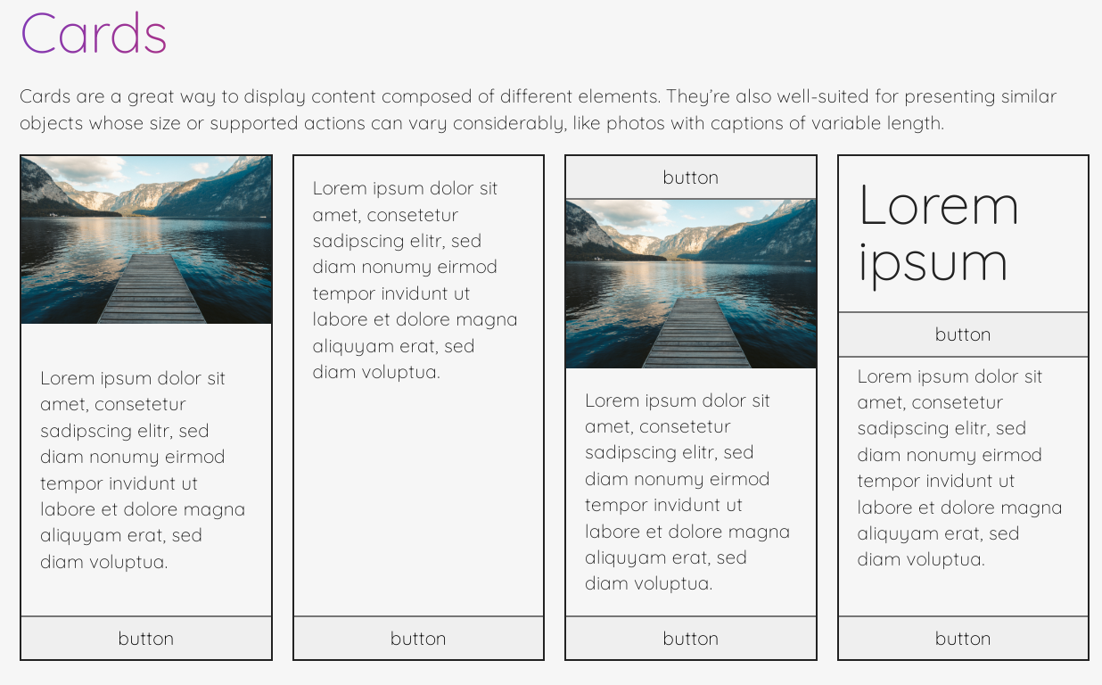
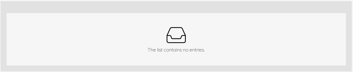


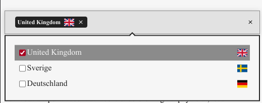
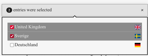


