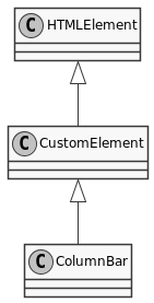
Constructor
new ColumnBar()
A data set
- Copyright
- schukai GmbH
Members
defaults
To set the options via the html tag the attribute
data-monster-options must be used.To set the options via the html tag the attribute data-monster-options must be used.
| Name | Type | Description | ||||||
|---|---|---|---|---|---|---|---|---|
templates | Object | Template definitions Properties
| ||||||
datasource | object | The datasource | ||||||
autoLoad | boolean | If true, the datasource is called immediately after the control is created. |
- See
- https://monsterjs.org/en/doc/#configurate-a-monster-control The individual configuration values can be found in the table.
(static) instanceSymbol
This method is called by the
instanceof operator.This method is called by the instanceof operator.
Methods
assembleMethodSymbol() → {Monster.Components.Form.Form}
Returns:
(static) getCSSStyleSheet() → {Array.<ColumnBarStyleSheet>}
Returns:
- Type:
- Array.<ColumnBarStyleSheet>
(static) getTag() → {string}
Returns:
- Type:
- string
