Constructor
new Select()
A highly configurable select control
- Since
- 1.0.0
- Copyright
- schukai GmbH
import {Select} from '@schukai/component-form/source/select.js';

const select = document.createElement('monster-select');
select.setOption('mapping.labelTemplate', '${name} (${alpha-2})')
select.setOption('mapping.valueTemplate', '${country-code}')
select.importOptions([
    {
        "name": "United Kingdom",
        "alpha-2": "GB",
        "country-code": "826",
    },
    {
        "name": "Sweden",
        "alpha-2": "SE",
        "country-code": "752",

    },
    {
        "name": "Germany",
        "alpha-2": "DE",
        "country-code": "276",
    }
]);

document.body.appendChild(select);
Extends
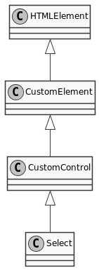
- CustomControl
Members
defaults
data-monster-options must be used.To set the options via the html tag the attribute data-monster-options must be used.
| Name | Type | Default | Description | ||||||||||||||||||||||||
|---|---|---|---|---|---|---|---|---|---|---|---|---|---|---|---|---|---|---|---|---|---|---|---|---|---|---|---|
toggleEventType | Object | click,touch | List of event types to be observed for opening the dropdown | ||||||||||||||||||||||||
delegatesFocus | boolean | false | lorem see mozilla.org | ||||||||||||||||||||||||
options | Array.<Object> | Selection of key identifier pairs available for selection and displayed in the dropdown. | |||||||||||||||||||||||||
options[].label | string | ||||||||||||||||||||||||||
options[].value | string | ||||||||||||||||||||||||||
options[].visibility | string | hidden or visible | |||||||||||||||||||||||||
selection | Array | Selected options | |||||||||||||||||||||||||
showMaxOptions | Integer | 10 | Maximum number of visible options before a scroll bar should be displayed. | ||||||||||||||||||||||||
type | string | radio | Multiple (checkbox) or single selection (radio) | ||||||||||||||||||||||||
name | string | (random | id) Name of the form field | ||||||||||||||||||||||||
url | string | Load options from server per url | |||||||||||||||||||||||||
fetch | Object | Fetch see Using Fetch mozilla.org Properties
| |||||||||||||||||||||||||
labels | Object | Properties
| |||||||||||||||||||||||||
features | Object | List with features Properties
| |||||||||||||||||||||||||
filter.defaultValue | Boolean | * | Default filter value, if the filter is empty | ||||||||||||||||||||||||
filter.mode | Boolean | options | Filter mode, values: options, remote, disabled | ||||||||||||||||||||||||
templates | Object | Template definitions Properties
| |||||||||||||||||||||||||
templateMapping | string | Mapping of the template placeholders Properties
| |||||||||||||||||||||||||
popper | Object | Properties
| |||||||||||||||||||||||||
modifiers | Array.<Object> | {name:offset} | PopperJS placement | ||||||||||||||||||||||||
mapping | Object | Properties
| |||||||||||||||||||||||||
formatter | Object | Properties
|
- See
- https://monsterjs.org/en/doc/#configurate-a-monster-control The individual configuration values can be found in the table.
value
Set selection
e = document.querySelector('monster-select');
e.value=1
Set selection
e = document.querySelector('monster-select');
e.value=1
| Name | Type | Description |
|---|---|---|
value | string | |
- Since
- 1.2.0
value
The current selection of the Select
e = document.querySelector('monster-select');
console.log(e.value)
// ↦ 1
// ↦ ['1','2']
The current selection of the Select
e = document.querySelector('monster-select');
console.log(e.value)
// ↦ 1
// ↦ ['1','2']
| Type | Description |
|---|---|
| string | |
(static) formAssociated
(static) instanceSymbol
instanceof operator.This method is called by the instanceof operator.
- Since
- 2.1.0
Methods
assembleMethodSymbol() → {Monster.Components.Form.Select}
blur()
The Button.blur() method removes focus from the internal button element.
click()
The Button.click() method simulates a click on the internal button element.
- Since
- 3.27.0
connectedCallback() → {void}
- Type:
- void
disconnectedCallback() → {void}
- Type:
- void
fetch(url) → {Promise}
If no url is specified, the options are taken from the Component itself.
| Name | Type | Description |
|---|---|---|
url | string | | URL to fetch the options |
- Type:
- Promise
focus()
The Button.focus() method sets focus on the internal button element.
- Since
- 3.27.0
importOptions(data) → {Select}
Import Select Options from dataset Not to be confused with the control defaults/options
.Import Select Options from dataset Not to be confused with the control defaults/options
| Name | Type | Description |
|---|---|---|
data | array | |
- Since
- 0.16.0
map is not iterable
- Type
- Error
missing label configuration
- Type
- Error
- Type:
- Select
(static) getCSSStyleSheet() → {Array.<CSSStyleSheet>}
- Type:
- Array.<CSSStyleSheet>
(static) getTag() → {string}
- Type:
- string